Data dashboards are powerful. They can communicate your community’s story and drive better data-driven decisions. But they can also be intimidating. Data dashboards have the potential to hold so much information, but what data is best suited to tell your story? In the Building Data Dashboards video series, Josh Wright and Erik Larson share best practices on how to tell your community’s story effectively with data dashboards. Topics include new types of data that economic developers are using right now and missteps to avoid when building data dashboards.
Erik Larson is the CEO of eIMPACT, a company that provides clients with data visualization dashboards. Emsi partners with eIMPACT to provide more compelling data visualizations to communities and economic development organizations.
Josh Wright leads Emsi’s Community Insights team whose focus is to help communities and states strengthen their economies and help job seekers find career success.
Part 1: How to Tell Your Community’s Story Effectively
Align with your strategic plan and strengths. (0:25)
Don’t shy away from unpleasant realities (2:34)
Put your best foot forward (4:18)
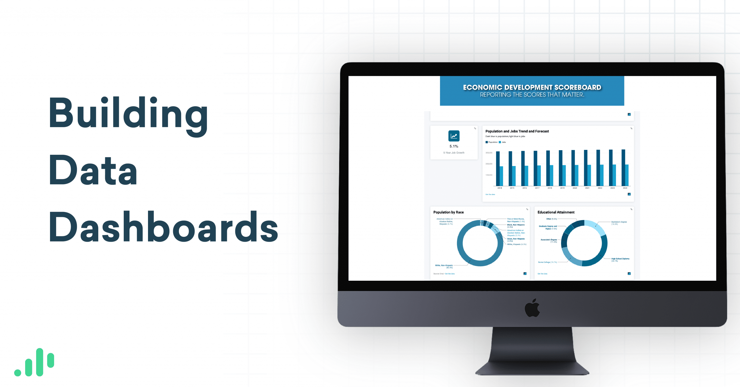
Data dashboards mentioned in this video: San Antonio Economic Development Foundation’s dashboard, and Greater Green Bay Chamber’s Economic Development Scoreboard.
Part 2: New Types of Data that EDOs are Using Right Now
Job Posting Analytics and other real-time data (1:16)
Social and health indicators in addition to economic indicators (2:39)
Data on remote workers (4:00)
Part 3: Missteps to Avoid When Building Data Dashboards
If you want to learn more about data dashboards and how they can help you tell your community’s story, contact us.