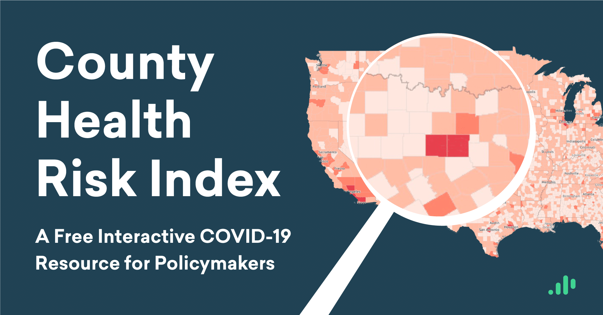

Last month, Emsi released the Health Risk Index, a free resource to help policymakers better understand where and why COVID-19 has spread. In an effort to further customize the index for local responses to COVID-19 (or any similar health crisis), we are releasing a new County Health Risk Index.
We first made this data available for all US metropolitan areas. Now, we’re including an additional interactive map that provides health risk analysis for all 3,000+ US counties.
Using the social determinants of health specific to each region, the Health Risk Index gives us the unique, nuanced perspective we need to fight COVID-19 and get the economy back on its feet.
Explore the Emsi County Health Risk Index
Four risk factors that predict COVID-19 hot spots

The Emsi Health Risk Index incorporates four key risk factors. These factors help explain why COVID-19 has had such a deadly impact in places like New York and why other regions have seen comparatively few cases.
Preconditioned population: The number of people who, within the past year, have been treated for diabetes, visited a cardiologist, taken asthma medications, or smoked.
Population density: The number of people per square mile in the region.
Workplace interaction: A measure of the overall workplace density of specific industries.
Population health: The age, income, and education level of the region’s population, which affect their overall health.
These four risk factors combine to create our overall Health Risk Index score—a highly accurate tool for predicting COVID-19 impact by region.
Health Risk Index now provides comparative COVID-19 risk analysis for all US counties
The new County Comparison tab on our interactive Health Risk Index map provides comparative risk analysis for all 3,142 US counties. Maps on the previous tabs provide comparative risk data for metropolitan statistical areas (MSAs).

Please note that the county-level risk analysis on this new map, and the MSA-level risk analysis found on the previous maps, are distinct apples-to-apples risk comparisons. The risk scores will differ accordingly.

For example, let’s look at the MSA-level risk analysis for the greater Dallas, TX, metro area. Here we can see that the Dallas MSA, in the context of all other Tier 1 metropolitan areas, has a risk index score of 0.53.
But when we look at the new county-level risk analysis, the numbers vary from what we see on the MSA map. This is because Dallas County is an individual county within the greater Dallas MSA. In the context of all other US counties, it has a risk index score of 0.61.
In other words, the risk score distribution is based on the type of geographical unit (county or MSA) and the extent to which individual units differ from others of the same type. We assign a risk score for each MSA relative to all other MSAs, and to each county relative to all other counties.

This is an application often used in a census or in geographical studies. The larger the sample (3,000+ counties vs 200+ MSAs), the larger the distribution and the greater the contrasting differences.
As we can see in the case of Dallas, this means that the comparative risk scores for individual counties will vary from the risk scores we find within the same region on the MSA Comparison maps in the previous tabs.
How to make decisions to reopen a county
Using both MSA-level and county-level health risk data can equip leaders to make decisions that are tailored to the needs of their own region. By providing the risk analysis for both types of geographical area, we can demonstrate how health risk varies between locations.
A county’s overall health risk score can help leaders determine the necessary resources and precautions for protecting both local health and economic prosperity. As various regions begin to reopen, policymakers, business leaders, and individual citizens can use this data as a guide. Learning which risk factors are most likely to affect their city or county, their workplaces, or their families can equip them to make fine-tuned decisions based on their unique regional data.
Learn more
For free Emsi resources to help you plan and respond to COVID-19, and to learn more about how to understand and apply the Emsi Health Risk Index, we invite you to read the white paper and explore the interactive map, check out the Job Postings Dashboard, visit our COVID-19 Resources page, or contact us: