
Welcome to the Letter from the Chief Economist.
If you asked me personally what the best workplace to get ahead is, my (subjective) answer would, of course, be Lightcast. But looking objectively, the data tells a different story: the best US company to work for is AT&T, followed by American Express and Cisco.
Why?
It’s not because they have neat office toys like ping-pong tables or because they offer whatever other perks employees are clamoring for. Instead, those are the top companies that offer their workers the best access to opportunity, pay, and upward mobility.
When we look at labor markets, we usually talk about big picture trends—but what matters most is how those trends affect individual workers. And the same is true of organizations: the overall success of a company is one thing, but the success of its individual employees can sometimes be another.
This week, Lightcast data was used in a new report that creates a new understanding of those relationships: “The American Opportunity Index: A Corporate Scorecard of Worker Advancement,” and compares the top 250 publicly-traded companies in the US based on real-world outcomes for over 3 million workers. It comes from our friends at The Burning Glass Institute, and it’s a joint project with the Harvard Business School and the Schultz Family Foundation, and also uses additional data from Glassdoor. I had a hand in this project in its very early stages, and I’m excited to see it come to light.
What sets this research apart is its deeper look at what happens to workers in the real-world with regard to job accessibility, mobility, and pay, instead of looking only at company policies. By publishing those comparisons, the report aims to help workers make informed decisions about which companies they apply to, recognize and celebrate companies creating opportunity, and giving leaders a reliable set of benchmarks and baselines to measure growth against.
Here are five of the report’s top takeaways.
Worker performance varies dramatically depending on their employer. To use just one example: a worker at a top-quintile employer earns 2.5 times more than a peer at a bottom-quintile firm—a lifetime difference of $1.5 million.
Opportunity looks different for everyone. The Opportunity Index scores companies based on nine total metrics, and their performance on each one can look very different, even if their overall scores look the same.
The data provides concrete goals. Its authors recommend these companies aim for an average time to promotion of no more than five years; five-year retention rate of at least 70 percent of a starting cohort; and wages that are at least 40 percent above the median for a given occupation.
Employer approaches need to be balanced. To succeed in this kind of benchmark analysis, companies need to excel in (at least) two of the three dimensions of opportunity—access, wages, and mobility.
Everyone has room for improvement—but most companies do some things well. Out of the 242 companies analyzed, 161 (or 66%) appeared in the top 50 in at least one model of success. The top 50 overall was also diverse, with 21 of 27 sectors represented.
Without meaningful insight and actionable data, it’s impossible for employers to have a complete picture of how their business compares to its field or for employees to fully grasp how best to align their choice of employer with their career goals. Research like this makes it possible to make solid choices about moving toward success, and also understand how well it’s being achieved. I’m glad it’s out there, grateful to the Burning Glass Institute and its partners for producing it, and looking forward to seeing how it gets used in real-world decisionmaking.
Inflation Up Again In September
This morning’s CPI came in hotter than expected; the last thing many of us wanted to hear as we look at rising prices for ourselves and worry about what it means for fiscal policy in the near future.
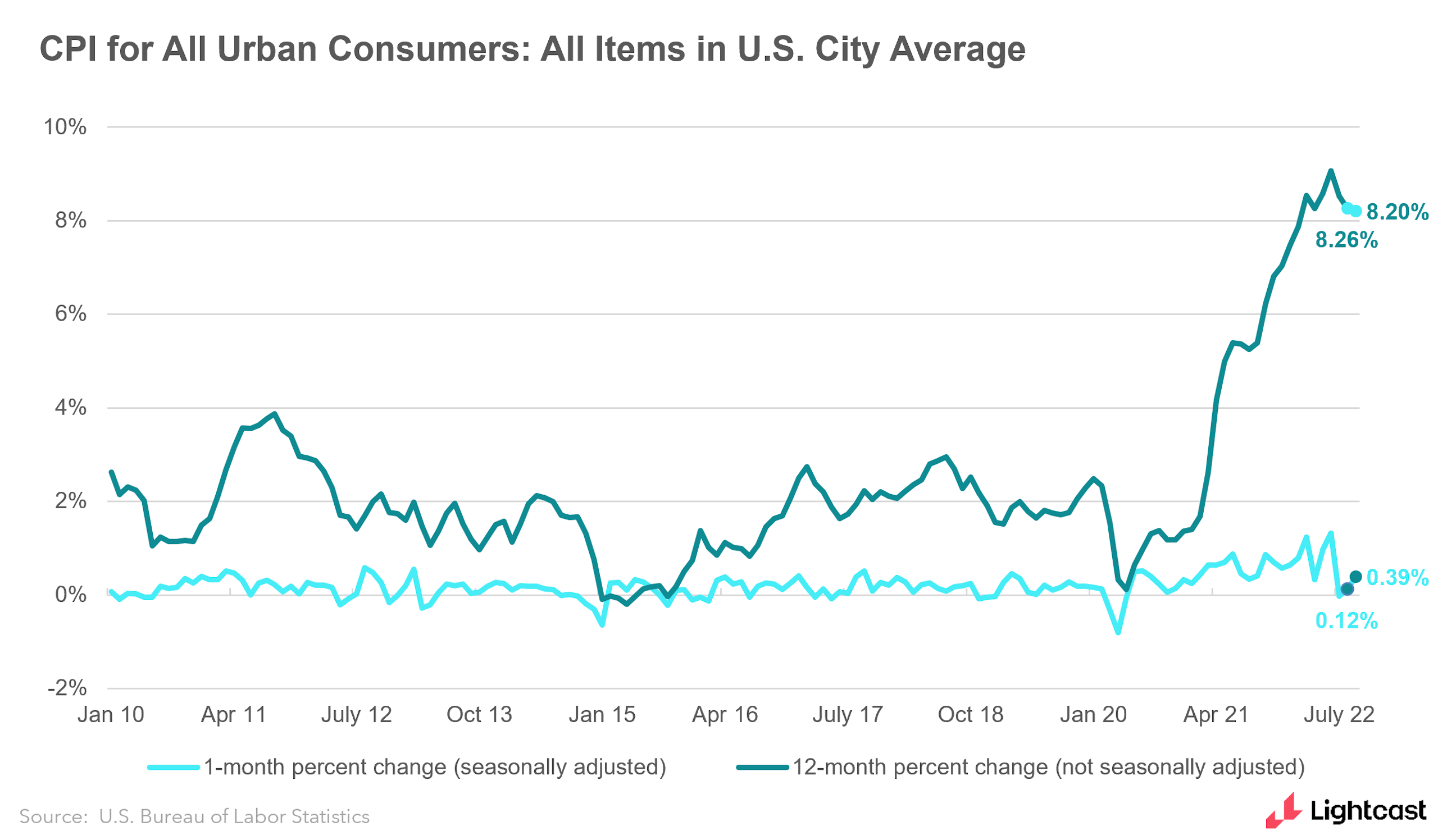
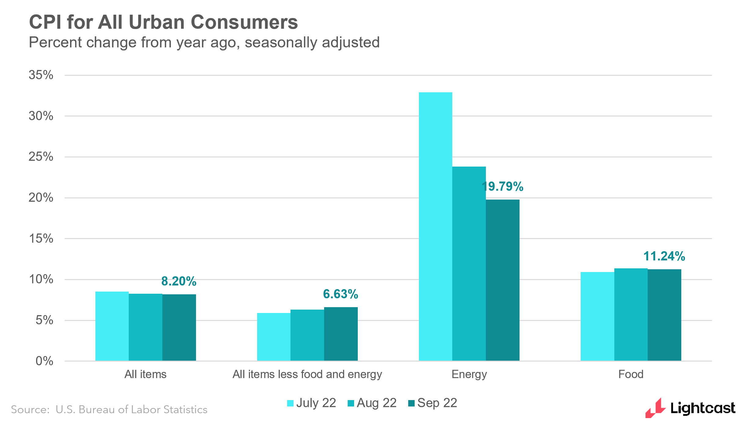
Year-over-year inflation ticked down (from 8.3% to 8.2%) but overall prices were up again in September, rising 0.4%. I was encouraged to see prices fall for fuel and used cars, but that good news was outweighed by prices going up in food, medical services, education, new vehicles, and household furnishings. Below is a closer look at the categories the Bureau of Labor Statistics considers.
This was the nail in the coffin for any hopes the Federal Reserve will slow down its interest rate increases. It’s almost certain they will raise rates by 0.75% in their next meeting in November, and it doesn’t look like we’ll see the light at the end of the inflation tunnel any time soon.
Here's some additional first-take analysis from my colleague Rucha Vankudre:
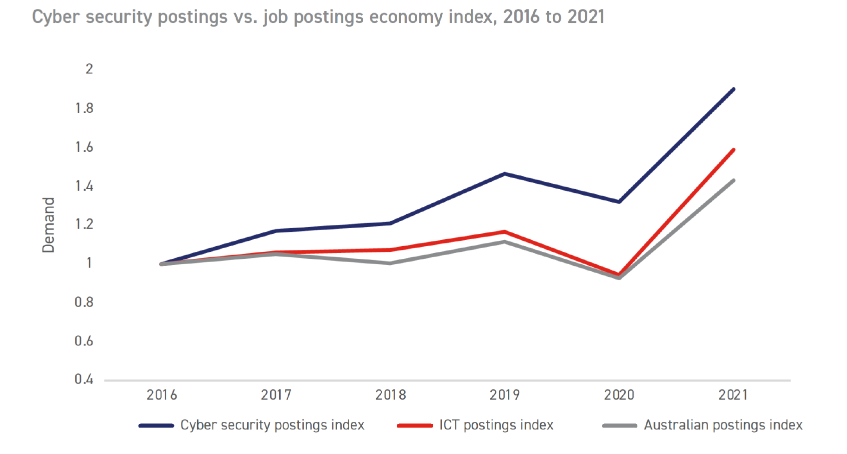
Tech Jobs Down Under
The Opportunity Index isn’t the only piece of research we’ve contributed to this week. Yesterday, Lightcast and the Australian Computer Society released a new report on the information and communications technology (ICT) industry in Australia, a comprehensive look on skills, wages, demand and other trends over the past five years. The ACS guide to IT professions 2022 is designed to show career pathways for those wanting to get involved in these technology jobs by analyzing what skills and patterns have shaped the industry since 2016.
The top-line numbers show that ICT jobs are growing fast in Australia. Lightcast data show that openings for those jobs have increased 15% more than the overall job market over the past five years, and this growth accelerated during the Covid-19 pandemic. These jobs now account for over 10% of all job postings in Australia, with over 115,000 postings in 2021.
And just like we’ve seen in the US, demand for cybersecurity jobs in particular has risen sharply: during the years studied, the share of those postings rose 33%, and there were almost twice as many cybersecurity postings in 2021 than there were in 2016.
As Lightcast continues to expand our ability to analyze labor markets globally, what stuck out to me in this report is how studying the job market in Australia compares to studying others around the world. The Australian Bureau of Statistics has its own method of sorting job titles, called the Australian and New Zealand Standard Classification of Occupation (ANZSCO), while at Lightcast we’ve developed a similar system with the Global Occupation Taxonomy.
Because the Lightcast taxonomy is shaped to accurately reflect employer demand, and does so at such a granular level, it was the primary method used to track the occupations in this report. This required some adaptation from the ANZSCO codes—separating out some of the occupations it specifies and consolidating others. Throughout this process, though, the report still includes the data to map Lightcast job titles to ANZSCO titles, so that the results can be compared across other reports and analyses.
In studying this data and putting together this report, I enjoyed seeing how labor markets vary around the world while also being able to see similar patterns emerge. I’m looking forward to seeing both how the ACS guide helps develop the ICT industry in Australia and also how Lightcast data can continue to help shed light on the global labor market—just as we navigate growing opportunity and changing economic conditions here in the US.
Until next week,
Bledi Taska
Lightcast Chief Economist