In a persistently challenging enrollment environment, institutions need to be strategic, proactive, and realistic when it comes to projections and planning. With population growth slowing and migration patterns shifting, enrollment teams can’t simply rely on past years’ trends to forecast next year’s performance. Things are changing, and institutions need to understand those changes in order to adapt and grow.
Fortunately, there’s an abundance of demographic data available to help do just that. Mapping out who lives where and how those populations are shifting can help institutions identify regions whose growth and demographic characteristics align with their mission and enrollment goals. This data-informed approach is key for not only avoiding unpleasant surprises, but also for uncovering otherwise overlooked growth opportunities.
To help you get started, we’ll outline several key demographic data points and summarize how they can inform your enrollment marketing plan.
(Note that much of this data is available from public sources, which we’ll link to along the way. If you’re a Lightcast subscriber, you can save time by accessing all of it in one place, with easily customizable reports, through the Analyst platform).
1) Understand the age profile of your region
US Census data divides the entire US population into five-year cohorts (e.g. 5 to 9 years old, 10 to 14 years old, etc.). These cohorts allow you to quickly analyze the relative size of different age brackets within a region. Starting with this data helps you understand the overall lay of the land, demographically speaking, and answer questions like: “How does the number of young people ‘in the pipeline’ compare with the number of college-age students today?” and “Is the bulk of our region’s population early-career, mid-career, or heading into retirement?”
Answering these questions can help you not only create realistic enrollment goals for specific types of learners (traditional, non-traditional, career advancement, etc.) but also identify marketing opportunities and even inform program development. For example, if under-18 year olds are a smaller share of the population than mid-career professionals, that could signal an opportunity to expand your offerings and update your messaging to cater to working adults.
To add a helpful layer of context to this research, compare the current age distribution to what it was five or ten years ago. This can help you go from a static snapshot to a dynamic picture of the mid-to-long term demographic trends in your region.
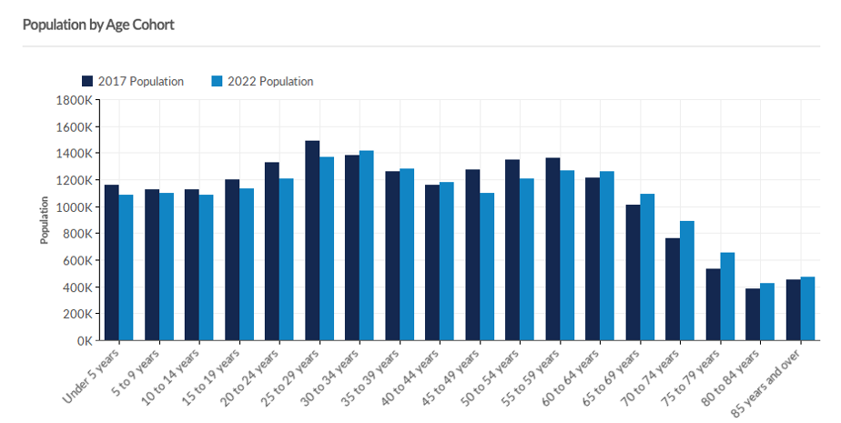
For example, the graph above shows the population distribution across all age cohorts in New York State this year compared to five years ago. You can see that most of the growth has happened at the tail end of the age spectrum while the younger cohorts are actually smaller now than they were in 2017. For institutions counting on new recruits from this region, this signals that both expectations and strategies will need to adjust moving forward when it comes to first-time freshmen enrollment.
Note on region selection
Of course, for this analysis to be meaningful, you’ll need to properly define your region. If you’re a community college, this might be the counties in your service area. If a university, this could be a set of counties, a whole state, or a multi-state region. For any institution offering online programs, it might include the whole country. If you’re focused on a particular residential campus, looking at regions within a certain drive-time radius (e.g. 45 minutes) might create the most realistic region of analysis.
To learn more about global demographic trends and other shifts effecting the current global labor market, read our latest research, Fault Lines.
2) Assess if your region is attracting or losing talent
The IRS produces migration data that tracks inflows and outflows at the state or county level for the entire US. While this data can’t be sliced by demographic subgroup (so you can’t tell the age, race, or gender of these individuals), it can give you a sense of whether or not your region is on an overall growth trajectory (or not) relative to your neighbors.
This provides a nice complement to the age cohort analysis outlined above: Age cohorts shed light on population change within a region, and migration data illuminates population change between regions.
From an enrollment perspective, this data enables you to:
Forecast how aggressive your institution might need to be in recruiting from outside your immediate region.
Pinpoint regions that are experiencing exceptional growth and therefore might warrant increased investment of recruitment resources.
Inform discussions with state legislators and community partners about the urgency of attracting more learners, workers, and families to the region (and retaining alumni when they graduate, but that’s for another article).
As Rural’s Rise demonstrates, employer job postings are an alternative (non-demographic) metric that can serve as a rough but more real-time proxy for regional growth. Whether people are following the jobs or employers are looking for people, the two tend to go together, even in the age of remote work. It’s a little more “fuzzy” than simply tracking where people move after the fact, but can provide a complementary, forward-looking perspective.
3) Find and measure concentrations of target populations
Growth often requires trying something new. In the context of enrollment planning, that includes looking outside your usual “go to” recruitment regions. But to inform this expanded outreach, you’ll want to look for regions that have a higher concentration of the specific students you’re trying to recruit.
For example, if you’re focused on bolstering enrollment of traditional college age students in the near future, you’d look for regions with a high concentration of 15 to 19 year olds. If you’re researching and planning further ahead, you can look even further “upstream” at regions with a high concentration of 10 to 14 or even 5 to 9 year olds.
Here’s a heatmap of zip codes in Tennessee and Kentucky that highlights the highest concentrations of 5-14 year olds in 2021. These would be promising areas to recruit from since they can be expected to have the strongest pipeline of young people:
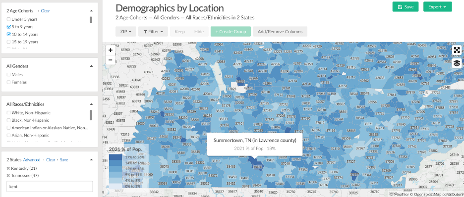
Knowing where young people are concentrated outside of your immediate region can inform a range of marketing and recruitment activities, from print and digital advertising spend, to local outreach events and partnerships with area high schools. On the flip side, you could focus on higher age brackets if you’re looking to recruit adult learners. In either case, the data can also inform projections about what kind of results you’re likely to see from those efforts.
4) Add a diversity, equity, and access lens
Colleges and universities have a range of recruitment goals that extend beyond “get more freshmen.” Many institutions are also seeking to cultivate a more diverse student body. Some institutions include commitments to diversity, access, and economic mobility as core elements of their mission. And still others are refocusing their efforts on meeting the unique needs of military veterans, working adults, and other nontraditional students.
Fortunately, there’s data available to help with these enrollment goals as well.
Race, ethnicity, and gender diversity
Institutions focused on increasing the diversity of their student body should align their marketing and recruitment strategy accordingly. Because applicant pools tend to reflect the demographics of the communities they come from, this starts with identifying regions where diverse populations are located. Like age data, data on race, ethnicity, and gender is available from the Census Bureau and can be viewed as far down as the county level.
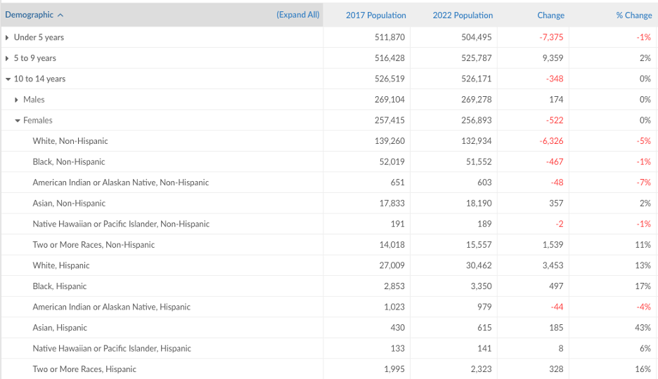
You can further refine your research by “stacking” demographic criteria to zoom in on sub-groups within a specific age cohort, gender, and ethnicities:
Poverty level
Institutions committed to access and equity should pay attention to socioeconomic diversity as well. Understanding income levels in target regions can help you forecast the number of potential applicants who may require some form of financial aid. This in turn should inform outreach and messaging about the availability of this aid. Students in low-income areas may assume a degree from your institution is out of reach and never even apply. If you have financial aid resources available, let them know.
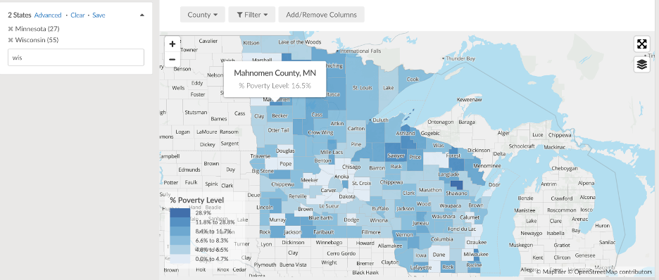
For example, the American Community Survey (ACS) program provides estimates on the percentage of residents living below the poverty level in a given area. In the following map, we see the relative concentration of poverty in each county of a two-state region:
Veteran status
Despite the challenges that can accompany pursuing college as an older student, sometimes with family responsibilities, military veterans are often well-positioned for success in higher education. On the practical side, they receive significant tuition benefits from the military. In terms of mindset, they’ve had years of real-world experience to help them clarify their strengths, weaknesses, and interests. Now, they’re ready to get the academic instruction they need to make a successful pivot into civilian life.
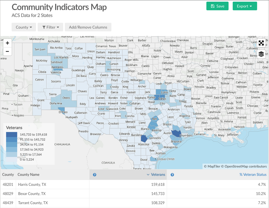
If your institution is looking to expand outreach to and recruitment of military veterans, demographic data can help you identify the regions to focus on. Using data from the ACS, you can verify where, and approximate how many, veterans live in certain areas. This data then feeds into decisions about ad targeting, special recruitment events, and other dedicated resources to ensure veterans know they’ll have the welcome and support they need at your institution.
Showing your work
As always, the goal is not to collect data for the sake of collecting data. Rather, the aim is to get the relevant information to the right stakeholders, so they can make informed decisions. With that in mind, let’s end with two practical tips for sharing your findings:
1) First, when trying to make sense of the data, it’s usually helpful to get your bearings by comparing your region of interest to some kind of benchmark. This puts the numbers in context and helps you gauge where the region has a unique advantage or disadvantage. A peer region (one of approximately the same size as your region), an average of peer regions, or a simple national average can all serve as helpful benchmarks.
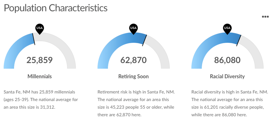
2) When it comes to sharing your research with stakeholders, make the most salient data available “at a glance.” Dashboards, like the one above, are a simple, effective visualization tool that can help ensure the data is used for decision making, not just tucked away in a binder. Maps, like the choropleth ones used throughout this article, are another effective way to make the data come alive. In general, remember to use effective visualization techniques — a little design goes a long way when you’re trying to make data digestible.
Next steps
Demographic data (important as it is!) is only one ingredient in an effective enrollment plan. It’s also important to assess your competitive landscape and evaluate how well your programs align with prospective students' career goals. Learn about data sources that can help you do this, including their respective strengths and weaknesses, in our free guide to program research.
Want to see an example of how demographic and labor market data work together to inform enrollment management strategy? Check out this 2017 case study on how Occidental College used both kinds of data to support enrollment growth.
Want to learn more about the connection between offering market-aligned programs and strengthening enrollment? Grab the four-page guide, or check out the companion webinar.


